The Power of Public Art: Enhancing the Places We Call Home
A natural offshoot of our team’s architecture, engineering, graphic design, and landscape architecture talents, contributing to public art projects is one of the ways we stretch our creative muscles. The most recent example is a concept created for the Carpio Sanguinette Park design competition.
Incorporating art into our public spaces has incredible benefits — for individuals, communities, and local economies. Art draws us out. It inspires questions, dialogue, contemplation, and even surprise as we go about our daily lives. Public art contributes to a community’s identity, creating a shared sense of pride and belonging. It also positively impacts local businesses, creating destinations for residents and visitors alike who frequent those near-by businesses. Finally, public art gives people an experience and provides artists greater visibility and recognition for their work.
Imagine the stress of your workday dissipating as you walk by a public art installation — your curiosity leading you to slow down and ponder what’s in front of you. Imagine you’re a tourist visiting a new place specifically to view an iconic sculpture that has defined that place, telling a story of the area and the people who live there. Or, suppose you’re looking to rent an apartment. All things being equal, would you choose a development surrounded by concrete or one near green space with public art that lifts your spirit?
Creating a sense of place
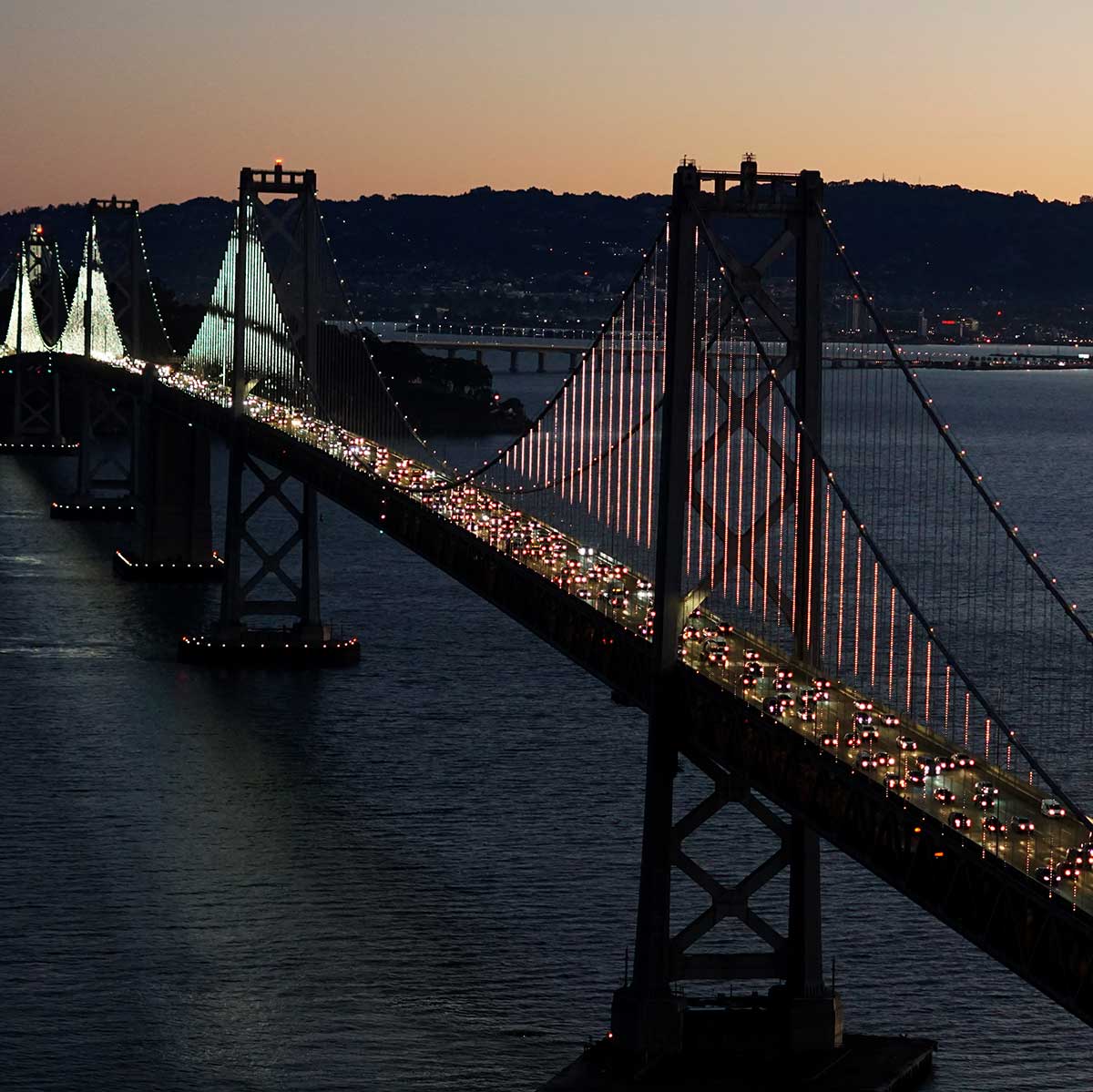
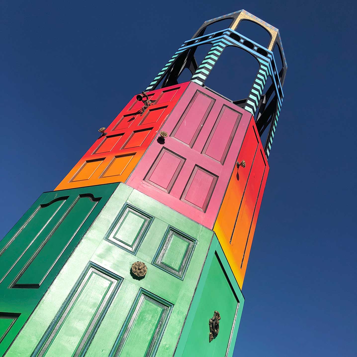
My favorite works of public art demonstrate how art can be incorporated into the architecture of a place, both on a small and large scale. Leo Vilareal’s joyful “The Bay Lights” is a great example with animated, patterned lights that stretch the entirety of the San Francisco-Oakland Bay Bridge, illuminating the Bay. In contrast, steps away is a smaller, temporary art installation by Engineered Artworks called “Welcome Tower,” constructed with reclaimed doors from local residents. It’s a reinterpretation of the iconic Coit Tower in the neighborhood and meant to inspire creative housing solutions given the challenges of rising home costs.
70% of Americans believe that the ‘arts improve the image and identity’ of their community.
— Americans Speak Out About the Arts, 2018
Harnessing the talents of many
As a graphic designer at an architecture and engineering firm, I’ve had the opportunity to contribute to public art projects with the support of a multidisciplinary design team. Utilizing this expertise and our collaborative design process, with input from clients and community members, we can tell a story with results that are dynamic and well woven into the context and culture of a place.
Recently, I was short-listed for a public art project for Carpio Sanguinette Park in Denver, Colorado. During the conceptual phase of the competition, I took full advantage of our team’s resources to help push creative boundaries and experiment with materials, while ensuring structural integrity and buildability. Additionally, I received architectural advice from our firm’s public arts team and assistance from our visualization experts to produce renderings and animation for the final presentation. Working across disciplines and harnessing the talents of our team helped ground my concept in reality.
The process for making a cultural statement
The Carpio Sanguinette Park concept began with a site visit, which revealed the area’s industrial surroundings, terrain, usage, and connection to the city. I interviewed visitors about what the park meant to them and took photos for reference. I delved into research about the area, including its smelting history and ecological environments, such as the surrounding wetlands and native wildlife.
Participating in a community meeting helped me create a framework for how to consider the needs and wishes of neighborhood residents — after all, public art is for the benefit of the public. The ultimate goals were to bring people together and help instill pride of place, so this was one of the most critical pieces of the process — learning about what matters and brings joy to the people who live there.
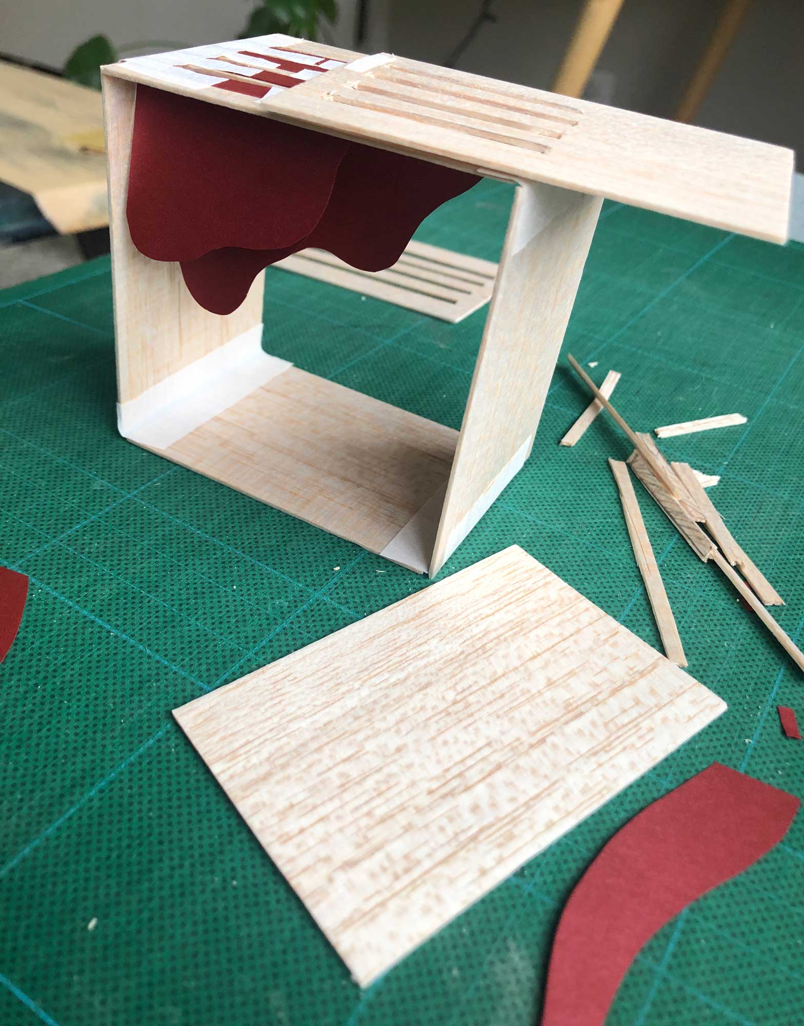
Allowing time for ideas my simmer, I started sketching concepts on paper and looking to other artists’ works for inspiration. I shared my ideas with our public arts team for feedback and refined and illustrated them digitally. Next came a 3-D model of my favorite concept, which I made out of paper and balsa wood to get a better idea of how the elements related to each other in space and ensure the sculpture would work well from all angles. The final step was working with our animator to produce the renderings and bring the concept to life.
It was a great experience and allowed me to share both how much I admire public art in our communities and the results of our teamwork, which was described by one of the jurors as “thorough and provocative.” Take a look!
What I heard most from listening to the different voices represented at the community meeting was the value of home. This art represents a home for all — people of all ages and backgrounds, wildlife, current or past residents, and visitors.
The box shape provides a feeling of home and safety. The aluminum flame represents the smelting history of the area as well as the past and current industry surrounding the park. The red color represents the history of cadmium mining. This flame also represents rebirth with the land’s reclamation and reuse. The aluminum heron’s wing shape grows from the flame, celebrating the new phase of the park. The wing also celebrates this native bird and Heron Pond nearby.
This concept explores many contrasts such as:
- The grain texture of the wood versus the smooth texture of the aluminum.
- The black, brown, red, and blue colors against the green grass and sky.
- The temperature when inside of the box versus when outside the structure and under the black overhang, which will be about 10 degrees higher in temperature.
- The feeling of heaviness when viewing outside facing the black overhang versus the flow of the “flames” and “feathers” with a light and airy feeling.
- The large simple shape of the box with sharp right angles versus the curves and multiple smaller pieces of the flame and wing.
- The exterior of the box with charred timber for a sleek aesthetic versus the interior natural wood and bright aluminum colors. It also symbolizes Colorado forest fires, tying back into the rebirth theme.
- The bolts showing on the exterior with an industrial look versus the interior’s clean look with smooth surfaces and no bolts showing through.
- The benefit of being interesting when viewed from many angles, including from a distance.
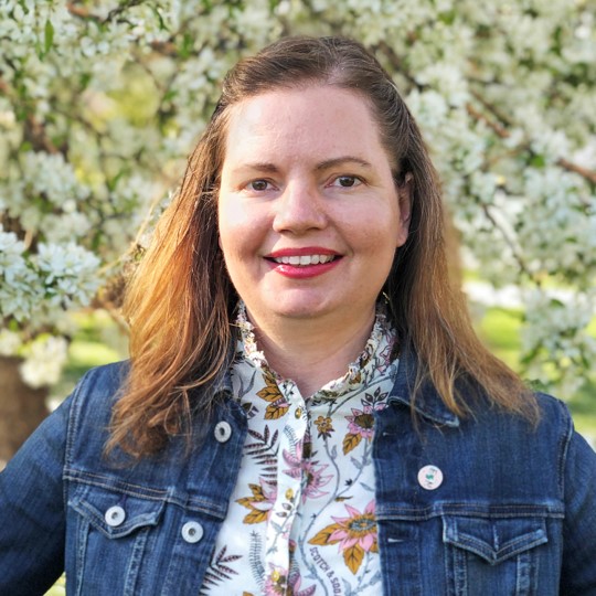
Nancy Bratton
Nancy is a graphic designer primarily, but describes herself as a hybrid professional, melding illustration, photography, experiential graphic design, furniture design, business development, and creative strategy. She loves teaming with Cushing Terrell’s multidisciplinary teams, including interior designers, planners, and architects, to deliver unique products and services for our clients and communities.

