On the Boards: VA Clinic Kalispell
The VA clinic in Kalispell, Montana— roughly 23,000 square feet —will house general practice, mental health, chiropractic, physical therapy, and telehealth services and more. The design team on the project was tasked with creating a thoughtful, attractive space that would meet the needs of staff and veterans.
Creating a sense of safety was paramount, so a great deal of research and thought went into design solutions that would make patients feel safe. Many veterans sensitive to reminders of their time in combat zones, so it was crucial to create an environment that is not only conducive to physical healing, but also to mental wellbeing.
From the waiting room to the plantscapes outside of the facility, the team worked to design spaces that evoked safety and steered clear of features or characteristics reminiscent of warzone environments.
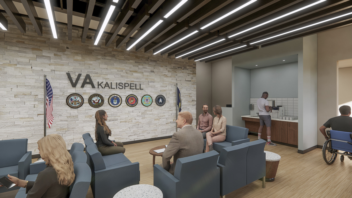
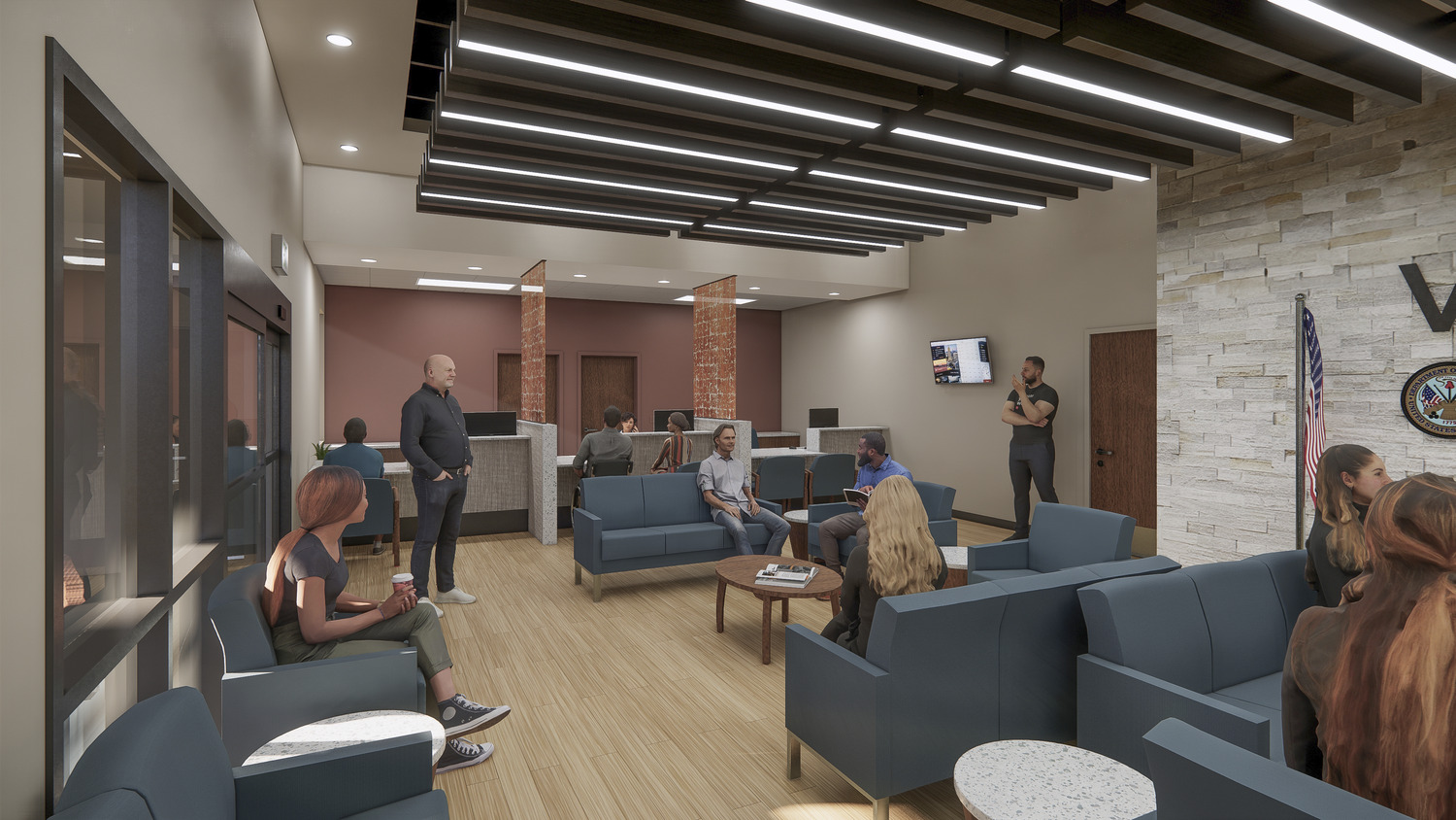
Waiting Room
The waiting room, a large, open space with high visibility incorporates a reverse soffit, dropping a central part of the ceiling to a lower, comfortable height to bring a cozy feeling into the room.
Important visual elements in the waiting area include logos that represent all six divisions of the Armed Forces and a palette of soft blues and other neutral tones to create a calming and comfortable experience. (The color green was avoided because its connection to combat fatigues). Choice pops of brighter colors were included as visual cues, such as the red wall behind the check-in desk designed to call visitors’ attention upon entering the space.
The computer kiosk, which is set away from the main seating area, allows visitors to sit behind a half-height wall and use the computer while facing the rest of the room with clear sight lines.
Corridors
One of the greatest design challenges was the building’s long corridors leading to treatment and exam rooms. The wrong patterns and colors would risk creating a spiraling effect that could disorient patients. The team focused on simplicity here as well as wayfinding elements that could help lead visitors to the right places and dissuade them from heading toward staff-only areas or dead-ends. For example, beautiful flooring patterns lead exclusively to patient-access areas.
Each of the four hallways feature large panels designed to mimic a mountain retreat atmosphere echoing the region’s mountainous features. For this, we used wood tones and natural colors.
Physical Therapy Space
Large windows surround the physical therapy space. While this is a great opportunity for lots of natural sunlight (which research has shown time and again to be instrumental in healing and well-being), it was necessary to be mindful of patient privacy.
The team designed a window film that allows light to filter in but distorts visibility. There are patterns on the film that include common military terms and Morse Code symbols—light fixtures and floor patterns that also mimic the dashes found in Morse Code, tying the whole space neatly together.
Throughout the project’s interior, heavy consideration was given to materials selection and use. As a government project, sourcing USA-made products took precedent. With extensive research, manufacturers were weeded out based on their sustainable operational standards. Additionally, the team selected heavy abuse-resistant finishes and products to achieve a sanitary, resilient space that feels safe, warm, and inviting and identified recycled content and/or materials that could eventually be recycled in the future as often as possible